Perimeter School - Strengthening Families. Impacting Homes.
A SPOTLIGHT ON Perimeter School’s BRAND strategy + VOICE
Brand Strategy | Message Clarification | Web Design | Social Media Strategy
Print Collateral | In-House Marketing | Event Strategy | Email Design
Meet Perimeter School.
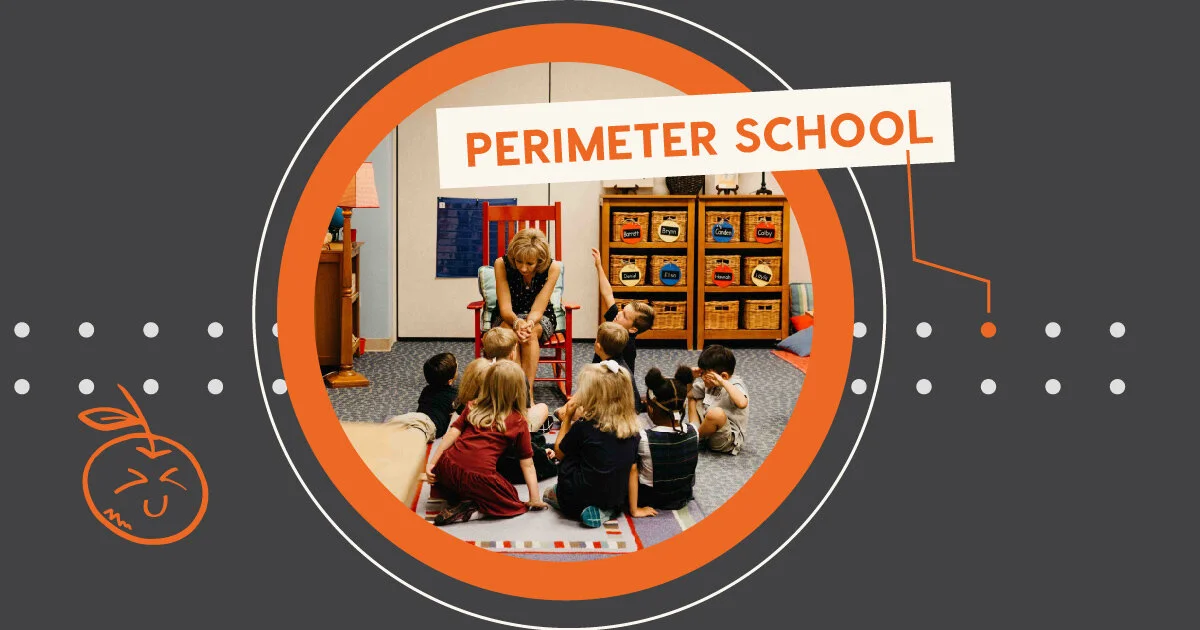
Perimeter School is a kindergarten through eighth grade school that invites families into an enriching community of faith and intentionality outside the classroom.
WHY WE WERE HIRED:
Perimeter School needed an updated website, a message that emphasized the right values, and a direction to simplify their communication and look consistent, professional, and personable.
What we focused on:
Simplifying and Reordering Language to Focus on Academics + Community - Always Both, Always In That Order.
What we loved about this project:
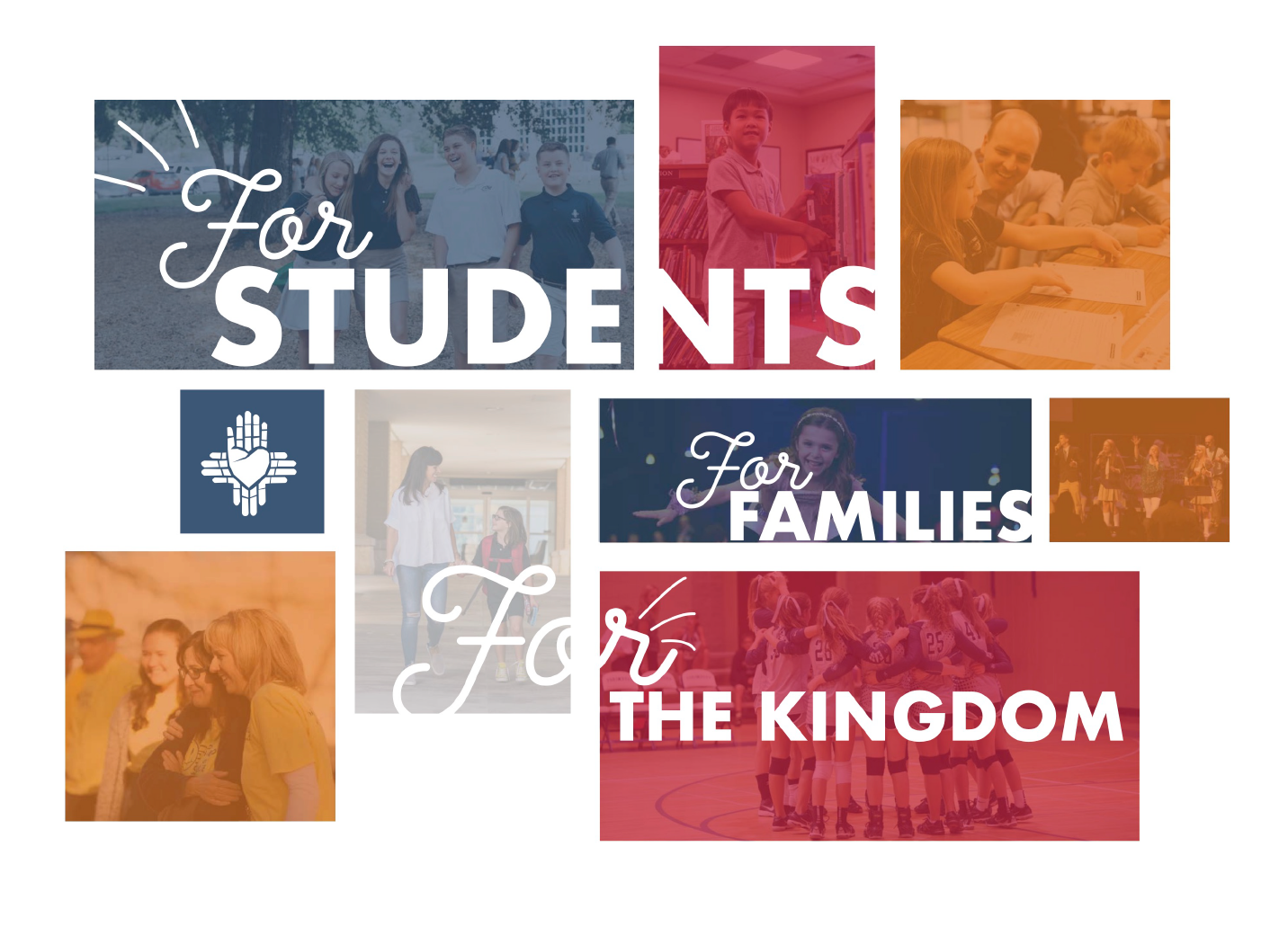
Proving the message of parent involvement, students being known deeply, and highlighting the product as a successful life beyond the school with photos, visuals, and new sharp focus on poignant language phrases.
A Behind the scenes moment:
Our research on local schools found parents completely absent across communications - even on parental involvement pages.
a Key messaging focus:
The messaging strategy, while strong and intimidating to some, reflects a tone that mirrors the Marines and the honor that the life-long reward of such an intense commitment to your students brings.
“We have never had so much vision and clarity on who we are and how we communicate. Orange Identity has taught us a new way of thinking. We are so thankful for their thoughtful strategy and now have the tools that make our community stronger.”
A FAVORITE DETAIL:
Perimeter School simultaneously became more professional and more playful with consistent branding that introduced fun colors and incorporated new ornamentation in icons, in-person signage, and their digital communications.
THE WHY BEHIND THE DESIGN:
Warm portraits of students, segmented equipping resources, dual navigation to please current families’ needs and help inquiring families move forward.
THE WHY BEHIND THE LANGUAGE:
Consistent reinforcement of a focus on students while highlighting the holistic benefits for family and eternity.
A FAVORITE DETAIL:
The welcome for an inquiring family shifted from overwhelming amounts of paperwork to a concise and thoughtful magazine design that highlighted the heart of the school.
When we knew it worked:
Our strategy not only reignited a new, clearer message be sourced for the school, but also it awoke a new life within the school as the community began to use our new language and details embraced the new identity.
what we loved about this partnership:
In adding meaning to marketing, our strategy focused on the dinner table and family conversations.
We created a Connect Jar to facilitate conversation and prove a heart for the family in the home.
A mark of getting better over time:
In our three years of partnership, our message has stayed consistent, but implementation and messaging are annually updated to invite new families to learn more.
a way to experience the difference:
A brand is the gut feeling of how someone feels. Perimeter School partnered with us to focus on mainstay signage, event experience, and other permanent and semi-permanent collateral to solidify someone’s brand trust.
Extending the impact:
Beyond developing a consistent brand promise, our partnership extended to event experience and branding.
Perimeter School's
Brand Is Different.
Perimeter School's
Brand Is Different.
Perimeter School desires its students to benefit from a strong education and a network of deep, gospel-centered relationships. Students are supported by a loving community to position them for life-long success.
Other Brand-Strengthening Work You May Like
Brand-Strengthening Work
You May Likeour thoughts on Branding, Life, and learnings from other great brands/people
Branding, Life, and learnings
from other great brands/peoplePARTY WITH US ON INSTAGRAM + FACEBOOK
PARTY WITH US
ON INSTAGRAM + FACEBOOK


